REVIEWS
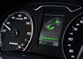
Audi A3 e-tronSportback 1.4 Attraction Pro Line Plus
87- Clear, high resolution display
- Consistent layouts and use of colour
- Easy control, even while driving
- Control knob rotates in the wrong direction
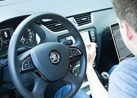
Skoda Octavia1.6 Greenline Business
68- Screen proximity detection
- Brand identity match in design
- Inconsistent methods of control
- Random use of icons
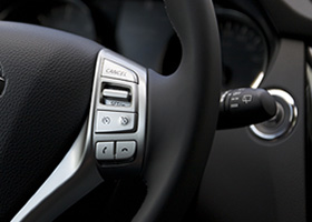
Nissan QashqaiTekna 1.5 dCi
80- No nonsense interface
- Consistent application of the visual style
- Sometimes a bit of a dull interface
- Display not readable with direct sun froom the glass roof
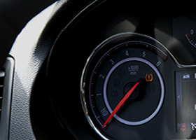
Opel InsigniaSports Tourer Business+ 2.0 CDTI
50- Switching from light to dark environment
- Love the size of the screen
- Confirm the input of the touchpad
- The brightness of the design functions as a 'lamp'
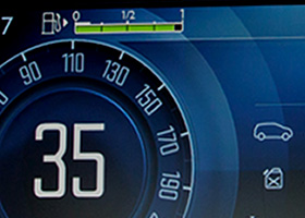
Citroën C4 PicassoBusiness Edition
65- Buttons are neatly mounted in the dashboard
- Simple (Clear / Clean) icons
- Different designs for two different displays
- Navigation map looks old fashioned
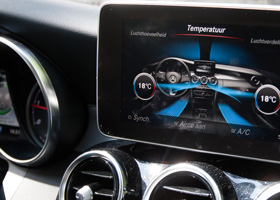
Mercedes-Benz C-KlasseC220 CDI Ambition Comfort
75- UI fits with the interior
- Legible and clear screen
- Dashboard screen feels cheap
- Use of color is not always consistent
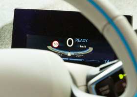
BMW i3Full Electric
85- UI fits with the interior and works like a charm
- The control wheel is within reach
- The input method
- Navigation is not ready for electric driving