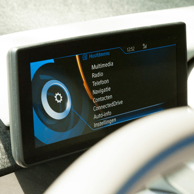
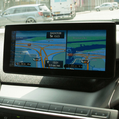
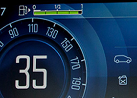
BMW i3 dashboard
BMW i3 small

BMW i3 Full Electric

The first full-electric car that we have tested. BMW embarked on a completely new path with the BMW i3 Full Electric. It doesn’t only look futuristic, it actually is. It’s time for us to get acquainted. At UNITiD we looked at both the features and the design of the interface screens in the car.

  • UI fits with the interior and works like a charm
  • The control wheel is within reach
  • The input method
  • Navigation is not ready for electric driving
 

THE TEST

The system becomes one with the interior of the car


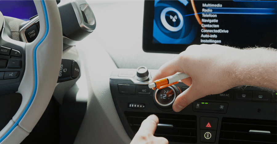
Even though the i3 is an extremely futuristic car, you are immediately welcomed by the familiar iDrive system which is found in all modern BMW’s. The buttons feel and do exactly the same, so as a BMW-driver you will feel right at home.

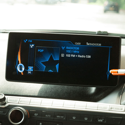
The use of the interface feels very smooth. It doesn’t stutter and you never have to wait. The hardware-controls feel luxurious and robust: clicks with the click wheel, button presses, etc. The interface is easy to comprehend. It is for instance very easy to search for radio stations or specific frequencies.


Navigating in an electric car
There are a lot of unnecessary steps required in order to start navigating: You first have to (at least on first-use) select a country, even though it’s likely this electric car will mainly be driven within one country. Once you have entered the destination address there are still two steps needed in order to start navigation: ‘use as destination’ and ‘initiate route guidance’.

The POI-navigation is quite cumbersome. There are many unnecessary layers present and obscure, very generic defaults are being used. In our test the driver didn’t succeed to navigate to the well-known POI ‘Gare du Nord’ in Paris.

With an electric car a long distance journey requires quite a bit of planning ahead. It would have been nice if the car would help with that. For our route (Amsterdam > Paris), about four time the range of the car, the car wasn’t able to assist on this. The system treats a long-distance route-navigation just like any other journey and shows an arrival time just as if you would drive the distance in one stretch. As a user you have to manually search for charging stations, add them to your route and calculate when you will be in need of the next charging station. To determine actual arrival time you will have to manually add up charging times, detour times to charging stations, etc.

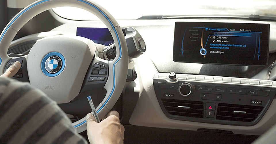
The system becomes one with the interior of the car
Icons can be found in several places. They are all line icons, but they do not always feel like part of the same series

REMARKABLE

Use of colours

Use of colours

It makes sense that the colour blue is being used, but this could’ve been implemented further. Apart of blue and orange hardly any signal colours are being used in the system, while you do encounter other colours in the rest of the interior.

SCORES

Tested on June 18 2014 by Hylke van Maaren, Jimmy Goedhart and Daan van Klinken

Identity

85

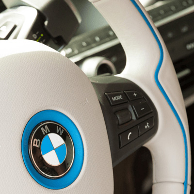
The blue lines visible on both the exterior as in the interior, are also present in the interface. This is a nice detail. Yet the backlighting of the buttons surrounding the control system are not blue, but red. The font that is being used is also not the same as on the physical buttons. Though this is not really distracting.

Identity

Hardware

75

Animations run smooth on the device, but can sometimes be confusing. The animations in the interface help explain your position within the menu, but this doesn’t always come across very well. Sometimes panes sliding into the screen leave you wondering where they came from. Fortunately the hardware button is always within reach so you can keep your eyes on the road.

The volume dialer has also gotten a primary position on the dashboard, which is very convenient.

The screen
The screen seems to be of very good quality. It is bright, crisp and runs very smooth. The graphical processor has no problems powering the screen. The glossy screen is very nice to look at, but dust becomes noticeable very quickly.

Hardware

Toptasks

80

The interface has a clear hierarchy, though this hierarchy is lost once you open up one of the applications. Icons are being re-used in different places in the interface. They are all outlined, but they don’t always feel as being part of the same icon set. In some instances the icons are straightforward leaving you wondering what they mean.

Toptasks

Usability

75

Navigation
The route navigation disappoints. Apart from the fact that the interface is quite complicated, you have to go through a lot of lists to get to an address. A convenient search tool is missing. During driving it doesn’t communicate how you would get there using an electric car, as it’s not a clear A to B route above a certain distance. Or how long it would take you to get there (including charging times).

Sub-tasks
Connecting a phone (up to four devices) is very convenient and information like contacts and media files are easy to find.

The bass is configurable in multiples places within the interface, for instance in the contextual view of the ‘Now playing’-mode. The ‘Now playing’-mode itself is difficult to find though. Unfortunately there is no ‘always on top’ entry point to ‘Now Playing’ on the display.

The parking sensors produce little beeps while reverse parking. We did find that there is quite a delay before the indicator beeps are audible.

Usability

Technology

65

For a car that is so technologically advanced, very little of this is reflected in the car interface. It is almost identical to those in other BMW’s. A big shortcoming is the omission of day-to-day use cases for electric driving in the navigation software. On the other hand, the park-assist camera is very convenient. It really shines on the beautiful large display.


One of the advantages of an electric car is that is can be preheated while it is charging. This is great for when it’s cold outside in winter and you can step into nice preheated car before driving to work in the morning. The feature can be controlled via a supplied app. The app has the same visual appearance as the interface of the car. Unfortunately we haven’t been able to test this app as you need a BWM account for this, and an actual car that is paired to the account.

Technology

COMMENTS

comments powered by Disqus