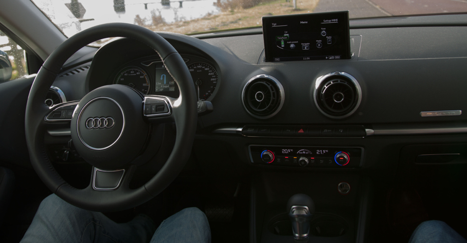
Audi A3 e-tron dashboard
Audi A3 e-tron small

Audi A3 e-tron Sportback 1.4 Attraction Pro Line Plus

With the e-tron, Audi is jumping into the increasing popular plug-in hybrid market. By combining the top selling model with an incredible electro motor, Audi seems to be on the winning side. But can they also deliver a winning UI?

  • Clear, high resolution display
  • Consistent layouts and use of colour
  • Easy control, even while driving
  • Control knob rotates in the wrong direction
 

THE TEST

Doing it right

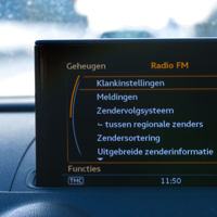
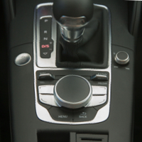
Step inside the e-tron and like any Audi cabin it's familiar but perfectly crafted. The design is clean, with every surface wrapped in soft leather or brushed aluminium. The A3 is fitted with Audi's flagship technology: MMI touch. This is the infotainment system that Audi has been refining for years. It consists of a rich 7-inch display that is controlled by a control wheel in the center console - located just under the handbrake. The central control unit contains an array of hard buttons, soft buttons, disappearing buttons, and even a fingertip sketch pad. The labels are clear, the design and layout are consistent and coherent and everything works snappy, smooth and intuitive.

The MMI system offers a simple menu navigation and a decent connectivity system. This system includes both USB and MDI inputs that can read and charge devices. Connecting your phone over Bluetooth is easy and straightforward.

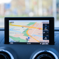
The 7-inch display is bright and well readable under various light conditions. The high positioning of the screen looks a bit awkward at first, but proves to be a smart move once you start driving. Having the display this far up makes it easy to quickly scan for information and focus back on the road without having to look down onto your dashboard and lose track of what's happening outside.

Information is logically clustered in main menu sections and colors are thoughtfully applied to provide contrast, highlight selections and subtly set the mood. All this makes Audi's MMI touch the best infotainment system we've used so far.

Doing it right
A consistent, coherent, snappy and intuitive setup - this makes it the best infotainment system we’ve encountered so far.

REMARKABLE

Taking the wrong turn

Taking the wrong turn

By turning the control knob clockwise you scroll up in lists. You scroll down by turning it counter clockwise. We would expect this to work exactly the other way around. This caused us to turn the wheel constantly in the wrong direction, even after playing with the system for quite some time.

SCORES

Tested on December 10 2014 by Robbert Ouwerkerk, Stephan van Dijk and Jeff van Steijn

Identity

85

Audi made the choice to not integrate the display into the dashboard but to place it on top of it. While this does not provide an integrated feel, the screen pops up smoothly while starting the car. In combination with the subtile startup animation, it provides a luxurious feel.

The UI feels spacious compared to the competition. Even when showing rich data like fuel stations, parking areas and navigation cues, the screen feels organised. Audi kept the design clear and consistent throughout all applications, and smartly applies highlight colours to guide you through their screens.

Identity

Hardware

88

Audi has resisted the temptation to fill the dashboard with a tangle of various little displays as we often encounter in hybrid cars. Instead the e-tron features a single, high resolution 7-inch color display that pops out of the dashboard when you start the car and closes when you turn it off. At first this high positioning on top of the dashboard feels a bit out of place but becomes clear once you start driving: having this display on top of the dashboard puts it closer to the windscreen. This makes it easy to quickly scan the screen for information and to focus back on the road.
The display is well readable, even when the sun shines directly onto it and both day and night modes are presented in a clear way.

Control wheel
Interacting with the multimedia system is achieved through a control wheel and surrounding buttons. They are easily accessible on the lower part of the center console. By turning the wheel you browse through the content. While pressing it confirms the selection. It takes a little time to get used to it, but after that it works like a charm: direct, snappy, easily accessible and usable while driving.
The wheel has a touchpad on top that can be used for input of text and numbers. Our experience with trackpads in cars is not that great, but this one managed to surprise us with its quick and accurate gesture recognition.

Hardware

Toptasks

90

The main menu options are directly accessible and the physical speed dial buttons allow easy access to the top tasks.

Navigation
The map is presented in a clear, cohesive way and the animations run smooth. With its various display and view options and the Audi A3’s Connect services are better than anything we encountered so far. The weather and map data look great, and are displayed in a rich way.
Entry of the destination is straightforward and easy to do while clear steps and options to choose from guide us through the process of defining our journey. Surprisingly, the letter and number entry with the control wheel works pretty well, mainly because of the system that assists the user by smartly filtering away the characters and numbers that do not result in any search match.
Navigation cues are clearly displayed and are also presented on the secondary display. This function is smart and makes glancing for the navigation hints quick, easy and non-dependable of the navigation screen.

Toptasks

Usability

84

While most other car manufacturers tend to move towards touch screens with surrounding hard-buttons, Audi sticks to it's MMI system without touch screen and with just a control wheel. Entering characters and numbers with the turning wheel takes a little to get used to, but it works great once you get the hang of it. Great advantage of the wheel is that it is remarkably easy to use while driving. It also allows you to stay focused on the road instead of trying to find and touch various buttons on a touch screen.

Climate control
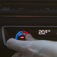
With the e-tron, Audi made a smart choice to stick to a turning knob for the climate control. Capacitive touch systems look modern and advanced, but lack haptic feedback on what you're doing. For example: How far do you need to swipe your finger to decrease temperature by four degrees? Here, you always know: four degrees, four tactile, audible clicks.

Usability

Technology

90

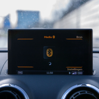
The e-tron is packed with technical goodies. Some come with the standard package, some can additionally be added. Establishing a Bluetooth connection between your phone and the car system is easy and straightforward. The Bluetooth pairing process requires multiple steps and should be executed while the car is parked. Re-connecting is achieved instantly. Contacts, media, playlists and even Spotify are easily accessible and playable.

Technology

COMMENTS

comments powered by Disqus