The Why of 'Car UI'

The Why of 'Car UI' Everything on the design and usability of digital car-interfaces.

The Why of 'Car UI'

It is quite easy to judge an interface on its looks. It’s the main thing you read about in reviews. But when you are driving your car, you don’t care about how the interface looks: you care about how it works. Context plays an important role in this; the car interface is not an isolated screen, it has a specific use in changing contexts. This is why at car UI we focus on the usability of the (digital) car interface and how its design can support this.

Our approach
We believe the best way to form an opinion about an interface is to actually experience and test it yourself. This is why we decided to set up a Car UI test centre. In this test centre we put all current and new digital car interfaces thoroughly to the test. We test an interface on various aspects such as the identity and brand image, the quality of the digital screens and the interface controls. We also use pre-defined top tasks to test the most commonly used features of the interface.

Top-tasks
The digital car interface controls many functions of the car these days. To put these interfaces to the test we defined a shortlist of tasks based on commonly used functions. Some of these tasks, such as controlling the temperature or changing the radio, are often performed while driving and should be usable while keeping your eyes on the road. Other commonly used tasks are just as important: destination entry for navigation for instance, or parking assistance. We rated these tasks on completion-time, complexity and legibility.

A STEP BACK IN TIME

Digital car control systems have been a much discussed topic lately. They offer us a lot of features, but are often found difficult to use as well. So how did we get where we are?

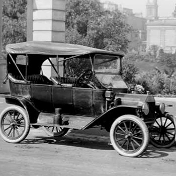
Cars have been designed and produced already since 1888, among others by Karl Benz. This has since quickly evolved into the automated car industry as we currently know it.

Identity, emotion and design

In the second half of the 20th century, more and more car brands started to emerge, increasing competition on the car market. This made that apart from all the technical improvements, car manufacturers started to differentiate their cars on brand identity and emotion. Strong and powerful versus stylish and elegant. But also cheap and functional versus luxury and passionate. It became increasingly important for a brand to incorporate a recognisable signature in the design of the car so people would recognise a car on the streets.

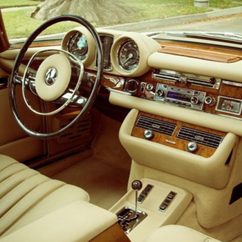
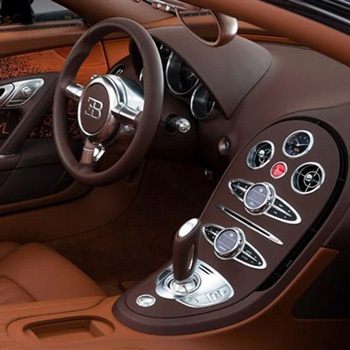
The dashboard played a key role in this, as it was the place where functionality and identity came together. It had to be one with the exterior design. Especially on premium brands such as Audi, Mercedes, Jaguar and BMW, where build quality and craftsmanship of the interior is just as important as the expressed emotion of the exterior.

Evolution of the dashboard

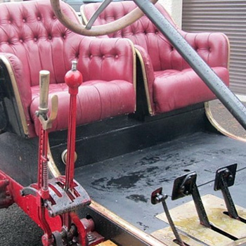
For a long time operating a car was hard work and took a full attention of the driver. On top of that it required knowledge of all levers, knobs and switches to get the vehicle started, moving and slowed down again in time. As cars started driving increasingly faster it also became more important for the driver to keep his attention on the road. This forced the dashboard and all its controls to become more intuitive and less distracting to ensure the driver would be able to anticipate and react naturally to unexpected situations on the road.

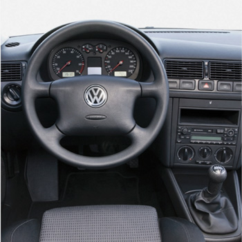
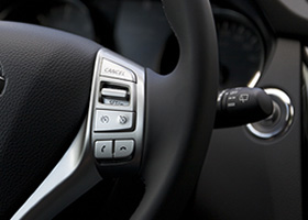
Towards the end of the 20th century the knobs, sliders and switches on the dashboard went through a long process of refinement on position, material, form, color and tactile feedback, eventually settling in to their current position. This consensus on optimal positioning makes that many common controls -temperature, windows, lights or radio- are now easy to find and control when entering a new car for the first time or while driving.

Based on this evolution, we can conclude the dashboard always meets the following requirements:

  • Controls for important functions are grouped together on the dashboard and can therefore be controlled almost blindly. For instance all climate controls are near eachother, just like lights and radio controls.
  • Controls should be intuitive to use. Knobs and switches provide visual and tactile feedback on the expected behaviour.
  • The ‘class’ of a car can be felt and experienced through the controls based on the applied material, design detail and tactile feedback.
  • Through placement, use of colours and size differentiation primary tasks are emphasised on the dashboard.

There are also downsides to these physical controls on the dashboard. Space is limited on the dashboard. As cars evolved the amount of features grew and with them the amount of controls claiming a position on the dashboard. This resulted in smaller controls and overcrowded dashboards, making them much more difficult to operated.
The advent of digital screens

The advent of digital screens

The advent of digital screens

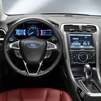
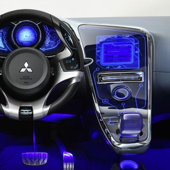
Over the past couple of years digital screen have started finding their way into the car dashboard. At first to communicate car and engine conditions near the primary gauges. Soon after they also started appearing in the middle console for navigation and audio playback control. As cars have been housing an ever increasing amount of features these screens have to control a vast amount of features. At the same time a trend is visible in the reduction of the amount of physical controls on the dashboard, putting more emphasis on the digital interface.

With this trend, car manufacturers have taken on the responsibility and a multitude of challenges to translate these physical controls to the digital realm. Challenges that they have, for the most part, not succeeded in solving yet. Many have been tempted to go all out on visual splendour, losing sight of functionality and usability. Resulting in an interface that has no correlation to the car’s unique make and model design language. Unlike the car itself, these interfaces are complex, difficult to use and often of inferior build quality.

As the digital screen has become the only method of controlling many of the car’s features, this leaves end-users with a steep learning curve to master all the features offered in the car. On top of that these digital screens no longer provide tactile feedback, requiring drivers to take their eyes of the road potentially leading to dangerous situations.

Dashboard

THE CHALLENGES AHEAD

Through the tests we are performing, we are gaining many insights on the current state of the digital car interface. We are uncovering both weaknesses and best practices. From this there are lessons to be learned. Here a few early take-aways that should be considered when designing an interface:

  • Apply a consistent and comprehensible mental model for navigation the entire interface.
  • Make use of easily identifiable buttons, lists and other interactive elements.
  • Know your end-user and its top tasks. Who are you designing for and what do they want to do?
  • Make use of a concept for the use of colours and apply this consistently.
  • Take into account contrast and viewing distance.
  • Provide clear visual (and audible) feedback after an action.
  • Learn from other design languages and patterns. Companies like Google, Microsoft and Apple all have their own design language for their digital user interfaces which they apply consistently across all their devices. Their design guidelines for developers are a valuable source for design language principles.

WHAT WILL THE FUTURE BRING US?
A long road still lies ahead, one with many opportunities. Technology is moving fast and bringing new possibilities every day. It will be interesting to see how the car interface keeps up with this. We are already seeing a movement towards voice control, even though it is still in its infantry. Also personalisation will be a hot topic, as the car will soon be able to recognise its drivers and both learn and remember its habits and preferences. In the meantime technology giants like Google, Microsoft and Apple are making a move for the car as well, bringing their ecosystems and polished user interfaces to the dashboard. Currently these still live on top of the interface the car comes with, but chances are these will integrate further with the car in the future. We’ll be here to keep an eye on all these developments and put them to the test.